Color Palette Extractor: How to Generate Color Schemes from Images
Complete guide to extracting color palettes from images. Color theory, generating harmonious schemes, and applications for branding and web design.
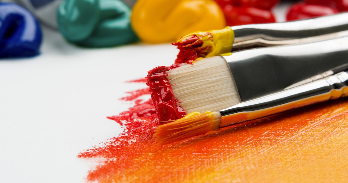
I was designing a website for a local artisanal coffee roastery, and the client showed me a photograph they absolutely loved. It was a close-up macro shot of freshly roasted coffee beans with warm brown tones, deep amber highlights reflecting off the oils on the beans, and subtle green undertones from the unroasted beans mixed in. Their entire creative brief was three words: 'Make it feel like this photo.'
At that moment, I could have spent hours staring at a color wheel trying to guess which colors would capture the authentic, warm, artisanal feel of that photograph. Instead, I uploaded the image to a color palette extractor and let the pixels tell me which colors to use. The result was a website color scheme that perfectly captured the brand's character because the colors were literally derived from their product. The client approved the design on the very first presentation.
Color palette extraction is one of the most powerful tools in any designer's creative workflow. It bridges the gap between visual inspiration and technical implementation, turning any image into a ready-to-use color scheme with accurate hex codes, RGB values, and harmonious color relationships ready to copy and paste into your design tools.
How Color Palette Extraction Technology Works
Pixel Analysis
The algorithm examines every single pixel in the uploaded image and records its color value in a color space like RGB or HSL. For a standard 1920x1080 image, that is over 2 million individual pixel values analyzed and categorized in a fraction of a second.
Color Clustering and Quantization
Similar colors are grouped together into clusters using algorithms like k-means clustering or median cut quantization. This reduces millions of individual pixel colors down to a manageable set of representative color groups.
Palette Selection
The most visually prominent and frequently occurring color clusters are selected and ordered into a palette. Advanced extractors also apply color harmony principles to generate complementary, analogous, or triadic color schemes.
Color Code Output
The extracted colors are displayed with their hex codes, RGB values, and HSL values. You can copy and paste these values directly into your design software, CSS stylesheet, or any other digital application.
Color Theory Basics for Better Palette Selection
Color Harmony Rules: Complementary colors (opposite on the wheel) create high contrast and energy. Analogous colors (adjacent) create harmony and calm. Triadic colors (evenly spaced) create balanced vibrancy. Monochromatic (single hue at different saturations) creates clean, professional sophistication.
Dominant vs Accent: The most frequently occurring color becomes dominant for backgrounds and large areas. Secondary colors become accents for buttons, links, and highlights. Together they create visual hierarchy.
Warm vs Cool: Warm tones (reds, oranges, yellows) create energetic, inviting palettes. Cool tones (blues, greens, purples) create calm, professional, trustworthy schemes.
Practical Applications
Web Design: Extract colors from brand product photos for cohesive, authentic color schemes. Brand Identity: Start with images representing brand values, then refine. Social Media: Extract colors from photos you post and use them for text overlays. Interior Design: Extract colors from a rug or artwork to choose paint and furniture.
Choosing the Right Image
Good even lighting for accurate colors. Focused color range for usable palettes. High enough resolution (500x500 sufficient). No heavy color filters that produce misleading results.
Refining Palettes for Production
Extracted colors are often too saturated for practical use. Reduce saturation 10-30 percent for backgrounds. Check WCAG contrast ratios for text. Extend into a full design system with 5-10 shades of each color.
Frequently Asked Questions
How many colors in a palette?
5-7 colors: 1-2 dominant, 2-3 accent, 1-2 neutral.
What formats can I extract from?
JPEG, PNG, WebP, GIF, BMP. Some tools handle RAW and HEIC.
What are hex codes?
Six-digit color values like #FF6B35 used universally in web design.
How to ensure color consistency?
Use sRGB color space for all digital design work.
Can I extract from a logo?
Yes. Logos have intentional limited palettes. Great for building brand-compliant systems.
Key Takeaway
Color palette extraction turns any inspiring image into a practical color scheme. Choose well-lit images with clear focused colors. Extract 5-7 colors. Refine saturation and contrast. Verify WCAG accessibility compliance. Extend into a full design system with multiple shades of each color for production use.
Final Thoughts
The coffee roastery website remains one of my favorite design projects because the color scheme felt right from the very first draft. It was rooted in something authentic and real. Try extracting a color palette from one of your own photos and discover a scheme you would never have imagined that perfectly captures the mood you are looking for.
Why Color Palette Extraction Matters for Design
Every designer has experienced the frustration of trying to build a color scheme from scratch. You stare at a blank color wheel, pull up trending palettes on Dribbble, or default to the same safe combinations you have used a hundred times before. Color palette extraction eliminates this creative block entirely by letting real-world imagery drive your color decisions. The colors that exist naturally in photographs, artwork, and branding materials already work together harmoniously because they come from the same visual context. This approach grounds your design in authentic visual relationships rather than abstract color theory.
The psychology behind this is fascinating. When you extract colors from a photograph of a landscape, you get the same earthy greens, warm ochres, and soft blues that naturally coexist in nature. When you extract from a product shot, you get the exact brand colors that the manufacturer chose for their packaging. When you extract from a piece of art, you get the intentional color relationships that the artist carefully composed. These colors work together because they already work together in the source image. The designer's job shifts from inventing color schemes to discovering and refining the colors that already exist in their visual reference material.
Color Harmony Science: Colors that appear together in natural photographs have inherent harmony because they share the same lighting conditions, atmospheric perspective, and environmental context. This is why a palette extracted from a sunset photo automatically feels cohesive, while randomly selected colors often clash. The human visual system evolved to find naturally occurring color combinations pleasing, and palette extraction tools leverage this biological preference. Understanding this science helps you make better choices about which source images to use for your palette extraction projects.
Understanding Color Models and Spaces
Before diving into palette extraction techniques, it helps to understand how colors are represented mathematically. The RGB color model defines colors as combinations of red, green, and blue light, with each channel ranging from 0 to 255. This is how computer screens display colors. The HSL model describes colors in terms of hue, saturation, and lightness, which is more intuitive for human understanding. The HEX format is simply a base-16 representation of RGB values that is widely used in web design. Each of these representations has its strengths, and professional designers learn to work with all of them fluently depending on the task at hand.
Color palette extraction algorithms typically work in a perceptually uniform color space like LAB or LCH, where the mathematical distance between two colors corresponds more closely to how different they appear to the human eye. This is important because RGB distance does not correlate well with perceived color difference. Two colors that are far apart in RGB space might look very similar, while two colors close in RGB space might look quite different to human perception. Perceptually uniform color spaces were developed specifically to address this limitation, and they are essential for accurate palette extraction.
Advanced Extraction Techniques
K-Means Clustering
This is the most commonly used algorithm for color palette extraction. The algorithm starts by randomly placing K color centroids across the color space of the image. Each pixel is assigned to the nearest centroid, creating clusters of similar colors. The centroids are then recalculated as the average of all pixels in each cluster, and pixels are reassigned. This process iterates until the centroids stabilize. The final centroids represent the dominant colors of the image. The value of K determines how many colors appear in your palette, with 5 to 8 being typical for design work. The algorithm is computationally intensive but produces excellent results for most images.
Median Cut Quantization
This algorithm works by recursively dividing the color space into boxes that each contain approximately the same number of pixels. Starting with the entire color cube, the algorithm finds the dimension with the largest range and splits the box at the median point. Each resulting box is split again until the desired number of colors is reached. The average color of each box becomes a palette entry. This approach is faster than k-means and produces well-distributed palettes, but it can miss subtle color variations that appear in small areas of the image. Many palette extraction tools combine both algorithms for optimal results.
Color Harmonies and Palette Generation
Once the dominant colors are extracted, modern palette tools can automatically generate harmonious color schemes using color theory principles. Complementary schemes use colors opposite each other on the color wheel, creating high-contrast, vibrant combinations ideal for calls to action and emphasis. Analogous schemes use adjacent colors for a harmonious, restful look perfect for backgrounds and overall brand identity. Triadic schemes use three evenly spaced colors for vibrant contrast that feels balanced rather than chaotic. Monochromatic schemes use variations of a single hue for elegant, sophisticated designs. These generated palettes expand your creative options beyond the direct extraction results.
Pro Tip: When extracting colors for a brand identity, use images that genuinely represent your brand values. A nature photographer's portfolio will give you earthy, organic colors. A tech startup's product shots will give you clean, modern colors. A fashion brand's lookbook gives you trend-forward color combinations. The source image quality directly determines the palette quality, so choose your inspiration images carefully and use high-resolution, well-lit photographs for the best results. Avoid heavily filtered or processed images as they may produce misleading palettes.
Practical Applications of Color Palette Extraction
Brand Identity Development
When creating a brand identity, extract colors from imagery that represents the brand's personality, industry, and values. A coffee brand's palette comes from roasted beans and warm café environments. A skincare brand's palette comes from natural ingredients and clean packaging. An outdoor gear brand's palette comes from landscape photography and product materials. The extracted colors will authentically represent the brand because they are literally derived from its visual world. This creates a brand identity that feels genuine and connected to the brand's essence rather than arbitrarily chosen.
Website and App Design
Use extracted palettes to create cohesive digital experiences. The dominant color becomes your primary brand color for headers, buttons, and key UI elements. Secondary colors work for backgrounds, cards, and sections. Accent colors highlight calls to action, links, and interactive elements. Neutral tones handle text, borders, and structural elements. This hierarchy creates visual consistency throughout your design and helps users intuitively understand the interface hierarchy. Users will subconsciously associate specific colors with specific functions, improving usability over time.
Social Media Content Creation
Maintaining consistent visual branding across social media platforms is challenging. Extract a palette from your brand's key imagery and use it as the foundation for all social media graphics, templates, and posts. The palette ensures that every piece of content, whether created by your design team or a social media manager, maintains visual consistency with your brand identity. This builds recognition and trust with your audience over time. Create Canva or Figma templates pre-loaded with your extracted palette colors to streamline content creation.
Interior Design and Home Decor
Color palette extraction is not limited to digital design. Interior designers use extracted palettes from artwork, fabric samples, and inspirational photographs to coordinate paint colors, furniture finishes, and decorative accessories throughout a space. Upload a photograph of your favorite rug or painting to extract a complete room color scheme that will harmonize with that central piece. This approach ensures that your entire room design is cohesive and centered around your most important design element.
Data Visualization and Information Design
Data visualizations benefit enormously from thoughtful color choices. Extract a palette from a relevant photograph or brand asset and use those colors for your charts, graphs, and infographics. The variety in natural palettes ensures good contrast between data series while maintaining visual cohesion. Avoid default chart color schemes that look generic and unprofessional. A carefully chosen palette can make your data visualizations more engaging, more readable, and more memorable for your audience.
Color Palette Tools Comparison
| Tool | Palette Size | Color Harmonies | Export Formats | Batch Processing | Price |
|---|---|---|---|---|---|
| Penkara Color Palette Extractor | 5 colors | Analogous, Complementary | HEX, RGB, HSL | No | Free |
| Adobe Color | 5 colors | 7 harmony rules | HEX, RGB, CMYK | No | Free |
| Coolors | 5 colors | Multiple rules | HEX, RGB, HSL | Yes | Free / Pro |
| Paletton | 4+ colors | 4 harmony rules | HEX, RGB | No | Free |
| Color Hunt | 4 colors | Curated palettes | HEX | N/A | Free |
How to Use Your Extracted Palette Effectively
Once you have extracted a color palette from your image, the next step is applying it effectively to your design project. The 60-30-10 rule is a timeless interior design principle that translates perfectly to digital design. Use your dominant color for 60 percent of the visual space, typically backgrounds and large structural elements. The secondary color covers 30 percent and provides visual contrast, used for headers, cards, and supporting elements. The accent color fills the remaining 10 percent and draws attention to key interactive elements like buttons, links, and calls to action. This proportional system creates visual balance and hierarchy that feels naturally pleasing to viewers.
Accessibility Warning: Always check that your extracted color palette meets WCAG contrast ratio requirements for text readability. A beautiful color scheme is useless if visitors cannot read your content. Aim for a contrast ratio of at least 4.5:1 for normal text and 3:1 for large text. Tools like the WebAIM Contrast Checker can verify your color combinations. You may need to adjust extracted colors slightly to meet accessibility standards while preserving the overall palette character. Accessibility should never be an afterthought in color selection.
Working with the Penkara Color Palette Extractor
Using the Penkara Color Palette Extractor is straightforward. Upload any image in JPEG, PNG, or WebP format up to 50 MB. The tool processes the image using advanced k-means clustering and median cut algorithms to identify the five most dominant colors. For each color, you get the exact HEX code, RGB values, and HSL values that you can copy and paste directly into your CSS, Figma, Sketch, Adobe XD, or any other design tool. You also receive automatically generated complementary and analogous color schemes based on the extracted palette, giving you a complete color system ready for implementation.
The tool also includes a Dominant Color Detector that finds the single most representative color in any image. This is particularly useful for generating cohesive thumbnail backgrounds, gradient bases, and loading placeholder colors. When used together, these tools give you everything you need to transform visual inspiration into a fully realized color system for any design project. The extracted colors are displayed in a clean, copy-friendly interface that integrates seamlessly into your existing design workflow.
Common Mistakes in Palette Extraction and How to Avoid Them
Even experienced designers make mistakes when working with extracted color palettes. One common error is using too many colors from a single extraction. A palette of five colors is usually sufficient for most projects, and using all of them equally creates visual noise rather than harmony. Another mistake is failing to consider the emotional impact of extracted colors. A palette extracted from a photograph of a desert landscape will have warm, earthy tones that feel different from a palette extracted from a photograph of a mountain lake. Always consider whether the emotional character of your extracted palette matches the message you want your design to communicate.
Relying entirely on a single extraction without adjustment is another common pitfall. Extracted palettes are starting points, not final answers. You should expect to adjust saturation, brightness, and even specific hue values to meet your design's specific needs. The extracted colors may need to be lightened for background use, darkened for text applications, or desaturated for neutral elements. The extraction gives you a harmonious foundation, but human judgment is still essential for creating a polished, professional final result.
Key Takeaway
Color palette extraction is not just a convenience feature for designers. It is a fundamentally better way to develop color schemes because it grounds your design decisions in real visual data rather than abstract color theory. The colors already work together because they come from the same visual source. The palette authentically represents your brand because it is derived from your brand's imagery. And the process is dramatically faster than building color schemes manually. Whether you are designing a website, creating a brand identity, developing social media templates, or planning an interior space, palette extraction gives you a professional-quality color foundation in seconds rather than hours.
Frequently Asked Questions
How does a color palette extractor work?
A color palette extractor analyzes every pixel in an uploaded image and uses clustering algorithms like k-means or median cut to group similar colors together. The most prominent clusters are identified as the dominant colors, and their average color values are calculated as precise HEX, RGB, and HSL codes. The result is a small set of representative colors that capture the overall color character of the image. The entire process takes just a few seconds for most images.
How many colors should a design palette have?
Most design projects work well with 3 to 5 colors in the primary palette. A typical structure includes one primary color for branding and headers, one secondary color for supporting elements, one accent color for calls to action, and one or two neutral colors for backgrounds and text. More complex projects like data visualizations or multi-page websites may need 8 to 10 colors across the full system. The key is to have enough colors for visual variety but few enough to maintain cohesion and brand recognition.
Can I extract colors from any type of image?
Yes, color palette extraction works on any digital image, but the quality of results depends on the source. Well-lit photographs with clear subjects produce the best palettes. Images with consistent lighting and limited color casts give more accurate results. Poor quality images with heavy compression artifacts, extreme filters, or inconsistent lighting may produce misleading palettes that do not represent the true colors of the subject. For best results, use high-resolution, well-exposed photographs with a clear color story.
What is the difference between a color palette and a color scheme?
A color palette is a set of colors that work together visually. A color scheme is a specific application of those colors according to design principles like the 60-30-10 rule or color harmony theory. The palette provides the raw materials, and the scheme determines how those materials are used in a specific design context. The same palette can support multiple different color schemes depending on which colors are assigned to which roles and how they are balanced within the composition.
How do I ensure my extracted colors are accessible?
After extracting your palette, test each color combination for WCAG compliance using a contrast checker tool. Ensure that text colors have sufficient contrast against their background colors. For body text, aim for a contrast ratio of at least 4.5:1. For large text above 18 point or 14 point bold, aim for at least 3:1. You may need to lighten or darken certain colors while preserving their hue to meet accessibility requirements. Tools like the Penkara Color Palette Extractor display colors in multiple formats that make it easy to test combinations.
Can I extract colors from brand logos for consistency?
Absolutely. Extracting colors from brand logos is one of the most common use cases. Upload the logo to the Color Palette Extractor to get exact brand color codes. This ensures that all your design work uses the precise brand colors rather than approximate matches. For even greater precision, combine this with the Dominant Color Detector to identify the single most important brand color for primary branding applications.
What file formats does the Penkara Color Palette Extractor support?
The tool supports JPEG, PNG, WebP, and GIF image formats with a maximum file size of 50 MB. This covers virtually all common image formats used in design work. The extracted colors are displayed in multiple formats including HEX codes for web development, RGB values for design software, and HSL values for color manipulation and CSS styling. All processing is done securely with automatic file deletion after the palette is extracted.
How do I choose the best source image for palette extraction?
Choose a source image that represents the mood, style, and emotional character you want your design to communicate. Images with clear color stories and good lighting produce the best palettes. Avoid images with heavy color casts, extreme contrast, or mixed lighting sources. The subject matter should relate to your project's context. A landscape photo for natural and organic brands, a product photo for commercial projects, or an artwork photo for creative designs all provide appropriate starting points for different types of projects.
Color Psychology in Palette Selection
The colors you choose for your design communicate subliminal messages to your audience. Blue conveys trust, professionalism, and calm, making it the most popular color for corporate websites and financial institutions. Red communicates urgency, passion, and excitement, which is why it is used heavily in clearance sales and food industry branding. Green represents nature, growth, and health, making it ideal for environmental and wellness brands. Yellow evokes optimism and warmth but can be tiring in large quantities. Purple suggests luxury and creativity. Black conveys sophistication and power. Understanding these psychological associations helps you select and adjust extracted palettes to communicate the right emotional message for your brand.
Creating a Complete Color System from Your Palette
A single extracted palette is just the starting point for a comprehensive color system. From your five extracted colors, you can generate a full design system that includes multiple shades and tints of each color for hover states, disabled states, and visual hierarchies. Lighter tints work well for backgrounds, cards, and hover effects. Darker shades work for text, borders, and emphasis. The full system might include 20 to 30 color variations that cover every possible use case in your design while maintaining consistency with the original palette.
Color Accessibility and Contrast Ratios
Critical Accessibility Requirement: WCAG 2.1 Level AA requires a minimum contrast ratio of 4.5:1 for normal text and 3:1 for large text (18pt+ or 14pt bold+). Level AAA requires 7:1 for normal text and 4.5:1 for large text. When working with extracted palettes, always verify that your text and background color combinations meet these minimums. Tools like the WebAIM Contrast Checker and Stark plugin for Figma and Sketch can help you verify compliance throughout your design process.
Meeting accessibility requirements sometimes means adjusting extracted colors. A beautiful deep blue extracted from your source image may not provide enough contrast against a dark background for readable text. In these cases, create accessible variations of your palette colors that preserve the hue and character while adjusting lightness to meet contrast requirements. These accessible variations become your text and interactive element colors, while the original extracted colors work well for large decorative elements and backgrounds where text contrast is not a concern.
Saving and Sharing Your Color Palettes
Once you have extracted and refined your color palette, save it in a format that works across your design tools. CSS custom properties make palettes easy to implement in web projects. Design system tools like Figma allow you to create shared color styles that your entire team can use. For documentation, export your palette as a visual reference with color names, HEX codes, and usage guidelines. A well-documented color system ensures consistency across your entire organization and makes onboarding new team members faster and smoother.
Advanced Color Techniques for Brand Design
Beyond basic palette extraction, advanced designers use techniques like color grading to shift the overall mood of an entire image collection, duotone effects that reduce images to two dominant colors for striking visual impact, and gradient generation from extracted palette colors for rich, modern backgrounds. These techniques build on the foundation of palette extraction to create more sophisticated and distinctive visual identities that stand out in crowded markets.
Integrating Extracted Palettes with Design Systems
For organizations with established design systems, extracted palettes can be integrated as theme variations or campaign-specific color schemes. A design system might have a core brand palette that rarely changes, supplemented by campaign palettes extracted from campaign imagery. This approach maintains brand consistency while allowing visual variety for different campaigns, seasons, or product lines. The extracted palettes enrich the design system without diluting the core brand identity.
The Penkara Color Palette Extractor makes it easy to generate and export these campaign-specific palettes. Simply upload your campaign imagery, extract the dominant colors, and export them in a format compatible with your design system tools. The process takes seconds and provides a professional-quality color foundation that you can refine and integrate into your existing workflows.
Key Takeaway
Color palette extraction is a powerful tool that transforms the way designers approach color selection. By grounding color decisions in real visual data rather than abstract theory, you create more authentic, harmonious, and effective color schemes. The best results come from combining algorithmic extraction with human expertise: let the algorithm identify the dominant colors, then apply your design knowledge to refine, adjust, and build a complete color system that meets accessibility requirements, communicates the right emotional message, and works across every application.
Color Palette Trends and Seasonal Considerations
Color trends evolve over time, influenced by fashion, technology, and cultural movements. Understanding current color trends helps you create designs that feel contemporary and relevant. Pantone's Color of the Year, fashion runway trends, and digital design movements all influence which color combinations feel current. However, trend-driven colors should complement rather than replace your extracted brand palette. Use trending colors as accents and campaign-specific variations while maintaining your core brand identity through the foundational palette extracted from your brand imagery.
Building a Color Palette for Multi-Platform Design
Modern brands need color systems that work across digital platforms, print materials, environmental design, and product packaging. Each medium has different color reproduction capabilities. Digital screens use RGB color space and can display vibrant, saturated colors. Print uses CMYK with a more limited gamut. Environmental design involves physical materials with their own color characteristics. A well-designed color system accounts for these differences, providing specific color specifications for each medium while maintaining visual consistency across all applications.
Color Theory Fundamentals for Designers
A solid understanding of color theory principles enhances your ability to work with extracted palettes effectively. The color wheel organizes colors by their relationships, with primary colors red, yellow, and blue forming the foundation. Secondary colors green, orange, and purple are created by mixing primaries. Tertiary colors fill the remaining positions with combinations of primary and secondary colors. Color harmony describes which color combinations are visually pleasing: complementary colors opposite each other on the wheel create vibrant contrast, analogous colors next to each other create harmonious compositions, and triadic colors evenly spaced create balanced variety. Understanding these fundamentals helps you evaluate and refine extracted palettes for maximum visual impact.
Color temperature describes whether colors feel warm or cool to viewers. Warm colors including reds, oranges, and yellows advance toward the viewer and create energetic, stimulating designs. Cool colors including blues, greens, and purples recede and create calm, professional atmospheres. Neutral colors including grays, beiges, and whites provide balance and breathing room in any design. When working with extracted palettes, consider the temperature balance and adjust colors to achieve the emotional tone that matches your project's goals. A palette that is too warm may feel aggressive, while one that is too cool may feel distant or uninviting.
Using Extracted Palettes in CSS and Web Development
Implementing extracted color palettes in web development is straightforward with modern CSS features. CSS custom properties, also known as variables, let you define your palette colors once and reference them throughout your stylesheet. This makes global color changes as simple as updating a single variable value. Define your extracted palette colors with descriptive names that reflect their use, such as brand-primary, brand-secondary, accent, neutral-light, and neutral-dark. Use these variables consistently across your components to maintain visual cohesion. HSL color functions in modern CSS give you additional flexibility to create variations of your palette colors programmatically by adjusting lightness or saturation while preserving the original hue.
For responsive designs, consider how your color palette adapts to dark mode and other user preferences. Your extraction process may produce a palette that works well on light backgrounds but needs adjustment for dark mode display. Create dark mode variations of your palette that invert lightness values while preserving hue relationships. Use the prefers-color-scheme media query to serve appropriate color variations based on user preference. This attention to color across different viewing contexts demonstrates professional design thinking and improves the user experience for everyone.
Color Accessibility Standards and Compliance
Meeting color accessibility standards is not optional for professional web design. WCAG 2.1 provides specific guidelines for color use that affect how you apply extracted palettes. Success Criterion 1.4.1 requires that color is not the only visual means of conveying information, meaning you cannot rely solely on color to indicate status, links, or required fields. Success Criterion 1.4.3 requires minimum contrast ratios between text and background colors. Success Criterion 1.4.11 requires that user interface components and graphical objects have sufficient contrast against adjacent colors. When applying your extracted palette to a design, verify compliance with each of these criteria and adjust colors as needed to meet accessibility standards.
Color Psychology in Brand Design
Colors evoke specific psychological responses that can either reinforce or undermine your brand message. Blue is associated with trust, competence, and professionalism, making it the preferred color for banks, healthcare providers, and technology companies. Green represents nature, growth, and sustainability, ideal for environmental brands and organic products. Red commands attention and conveys excitement, urgency, and passion, used effectively by entertainment, food, and retail brands. Purple suggests creativity, luxury, and wisdom, popular among beauty brands and creative services. Yellow communicates optimism and warmth but can cause eye strain in large quantities. Orange combines red's energy with yellow's friendliness for approachable, energetic brands. When extracting your color palette, consider whether the dominant colors communicate the psychological message that aligns with your brand identity.
Color Trends and Cultural Considerations
Color preferences and meanings vary significantly across cultures, which is important to consider when designing for international audiences. White represents purity and celebration in Western cultures but is associated with mourning in many Eastern cultures. Red symbolizes good luck and prosperity in Chinese culture but can represent danger or debt in Western contexts. Purple is associated with royalty in many cultures but with mourning in some Latin American countries. Understanding these cultural differences prevents unintended messaging and ensures your color palette communicates appropriately across all your target markets. When extracting palettes for international brands, research the color associations in your key markets and adjust your palette choices accordingly.
Abo Gamil
Author